In the meantime, a couple of Inkscape related things...
The About Inkscape 0.45 contest over on deviantArt has closed and a winner has been chosen!! No, I didn't get shortlisted or picked, but it was fun creating a few entries and there are some real nice ones. Congrats to molumen who created the winning entry. Very sharp!
Over the holiday I did manage to do a little noodling with Inkscape 0.45 (which is not officially out yet). One of the main updates in the latest version is the blur functionality. How it get implemented in a vector-based drawing tool is way over my head but I love it just the same. ;)
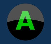
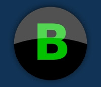
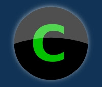
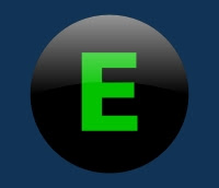
Here's a series of buttons I created which illustrate how very simple and subtle changes can have a significant impact on graphics:
All of these buttons are created in Inkscape with only either 3 or 4 objects. The button itself consists of a solid circle, a highlight semicircle (made with a simple boolean intersection of a circle and a polygon) and a text object - the letter. I've used an additional blurred circle object for buttons B,C and D.
 Button A looks kind of shiny because I've left the highlight grey object (which is actually a solid white object with its opacity reduced to around 40%) as a solid color - that is without any gradient. So you see the hard edge from grey to black. This button only consists of 3 objects, the black circle, the grey (transparent white) highlight object and the green text. Looks ok I guess.
 Button B isn't a heck of a lot different from Button A. I've made 2 simple changes here. Actually the first is just to change the text from A to B. Inkscape is nice in that you can just double-click on the text and immediately edit it in place. The second more meaningful change is to duplicate the black circle, blur it and set it back behind the button (but above the blue background). This gives more of a photorealistic look in my opinion. It's not quite a drop shadow but I think it enhances the button. You can use this method to enhance many different kinds of graphics when you want to maybe add impact, depth or emphasis to some object and yet be subtle about it.
 Button C is identical to Button B except that I changed the blurred circle underneath to a light blue colour instead of black. this kind of gives a backlit effect. Not so subtle but maybe useful in moderation when you're looking for that effect. I see a lot of building signage with this look. They slightly raise the letters off the building and light behind them. You can go quite brazen with this effect or keep it subtle as I've done here. Again, it's just a simple blurred circle beneath the base button object.
 Button D looks significantly different from the previous ones, but is the result of only one simple change. In fact it is exactle the same as button B, except that I've taken the grey highlight object and applied a gradient so that instead of a solid grey, it goes from a solid grey at the top to transparent at the bottom. You can see here how a simple change to the highlight gives a completely different feel to the object. Instead of shiny you get something a lot more matte. Again, a very simple change makes a significant difference to the image.
 Button E is really just academic. I've taken button D and removed the blurred black circle behind the button. So it is effectively button A with a gradient applied to the highlight shape instead of a solid grey.
Hopefully someone will find this useful. Inkscape makes it so easy to experiment and play around that you find new things out all the time. If you spot some graphic or effect that you love while cruising the net, don't think it's impossible to create. Just stare at it and imagine how you might achieve those effects in something like Inkscape. It's usually much easier than you think. ;)


5 comments:
thank you, you just made my day.
I'm not a designer, I'm a web developer and I'm always curious about how designers do their magik. i was particularly looking for button creation on inkscape. great tool, I love it.
I got just one cuestion. ¿How do you do the blurry circle?
The dark blurry circle effect is subtle and elegant, i liked it.
Glad you liked it. I'm no graphic designer by any stretch (actually I design structures in my day job) but I like to dabble.
The blur effect is a new feature in Inkscape 0.45 which was just released a few days ago. You just draw a solid black circle and then in the fill and stroke dialog (Ctrl+Shift+F) you will now see (in version 0.45) a blur slider. I placed that blurry circle under the button to get that effect.
Hey thank you for the tips. I love inkscape too, it's a very powerful tool, but there could me more powerful tips like yours :)
Hey Richard, you said you made the highlight by intersecting a polygon with a circle. Can you go over the exact process you used to make that? I'm attempting to learn a bit here, and this part is really confusing me. Thanks!
Hi Scott,
Rather than try to explain it here, I thought it might be better and more useful to do a quick screencast describing the process. Check out my latest post here. Hope it helps.
Post a Comment