This time we're going to take a quick gander at histograms. As always, this will not be an all-encompassing discussion but a more practical look at what a histogram is, and why it can be useful to the digital photographer. Note: for those in the know, I have stayed away from things like output range, RGB channels and the like, to keep it simple and straightforward. As always I'll try to point out a few good resources for further info.
In terms of digital imaging, a histogram is a vertical bar graph showing the frequency distribution of the different tones in your image. More simply, and more importantly, it's a graphical representation of the exposure of your image. Imagine if you took a count of all of the pixels in your image and categorized them by their tone into 256 shades of grey (from black through to white). Now if you create a bar graph showing the number of pixels in each of the 256 categories with black on the left and white on the right, you would end up with a typical histogram. Here is a typical image histogram. (Note my screenshots were taken using the GIMP, but histogram displays are similar in other image programs like Photoshop, PaintShop Pro, etc.)
The key things to remember when looking at a histogram for one of your images are:
1. The left end of the histogram represents black, the right end represents white.
2. The height of the curve above the horizontal (or 'zero') axis indicates the relative quantity of pixels at that tonal value. So when the curve hits the horizontal axis, there are few, if any pixels at that value.
3. By virtue of 1. and 2., if the curve runs into the left end of the histogram before hitting the horizontal axis, there are a significant number of pure black pixels.
4. Also by virtue of 1. and 2., if the curve runs into the right end of the histogram before hitting the horizontal axis, there are a significant number of pure white pixels.
5. If the curve runs into the horizontal axis well before it reaches the left or right ends, your image may not be making use of the full tonal range and might be significantly improved (more on this in a moment).
6. There is no one single ideal histogram curve. That is to say that 3. does not necessarily always indicate underexposure, and 4. does not necessarily always indicate overexposure. (eg. if you are shooting a scene with lots of black in it, you will undoubtedly get the situation described by 3.)
7. Just to confuse matters, it must be said that the histogram of an image can give you a good indication of over or under-exposure conditions in your image.
8. If you have an option on your digital camera to view the histogram after taking the shot (no matter how small the display), you would do well to utilize it. A small histogram can in most cases be a better, more accurate indicator of exposure problems than viewing the image itself on a camera's LCD display.
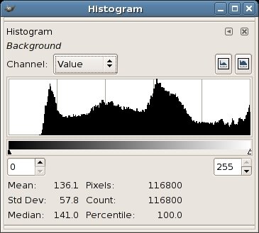
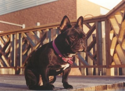
So let's look at an example histogram for the image below (a striking pose by Delilah, our Frenchie):

Here is the histogram for the image:

As you can see, there is a peak at the leftish end, most likely coming from the fact that our model Delilah is very dark. There is also another peak just right of the midpoint which is most likely coming from the abundance of wooden decking and brick in the picture.
Another key thing to note is that the right hand end of the histogram does not reach the horizontal (zero) axis - in fact it's rising up when it reaches the right end. This indicates that there are a significant number of pixels in the shot that are approaching pure white. This comes from the overexposed blotches in the upper right.
Finally, it can be noted that the left end of the curve reaches the horizontal or zero axis prematurely. This indicates that there are no pixels in the shot that are pure black. It's important to note that in this specific shot, we know because of Delilah's colour, that there should be some pixels that are approaching pure black, but in other cases there may not be any pixels approaching black (take for example a photo of a blue sky with clouds). Anyway, for this specific image, this looks like a situation where we're not utilizing the full tonal range in the image.
So how can we improve the image?
Well, unfortunately there isn't much that we can do with all the overexposed pixels in the upper right. It's difficult to recover image information from overexposed areas such as this. I've chosen to just ignore it, reasoning that it's not worth the trouble to fix (you could crop it out if desired).
We can however do something to better utilize the tonal range of the image. By using the 'Levels' tool found in many image editing programs, we can improve the image significantly. Let's look at the levels tool within the GIMP. There are similar tools in many other image editing tools as well - they won't differ too significantly from what I describe. Here is the levels dialog box:
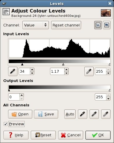
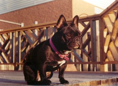
If we move the left slider in a rightwards direction as shown above so that it just stops where the histogram hits the zero axis, we can improve the image. Note that if there was a flat area on the right end of the histogram we would make a similar adjustment there. Also, there will almost always be a middle slider that will let you adjust the gamma of the image. This will result in brightening or darkening the midtones of the image. You can see that I made a slight adjustment to the gamma slider as well to slightly brighten the image after making the left-slider adjustment. If there is a preview checkbox available, I suggest you keep it on, as you want to see the dynamic changes to your image as you adjust. Here is a comparison of the original and corrected images (obviously the lower shot being the corrected one). Hopefully you will see the improvement:
This is a quick fix that you can apply to any of your images that need a little extra punch. You might also find that your camera rarely gives you an image whose histogram is this far out of whack, but it does sometimes happen. Scanning prints will notoriously result in histograms with flat left (and right) hand sections. I remember having to do this virtually all my scanned photos. Luckily it is a quick fix and only takes a few seconds to perform.
So what are the take-away points of all this?
If your digital camera provides a histogram display, make use of it, no matter how small it is. Once you get used to interpreting it, you'll find that you can spot problematic photos immediately and possibly retake them with exposure compensation to correct the problem.
Don't blindly expect the perfect 'mountain' curve in your histogram for every image. You may very want a lot of white pixels or black pixels in your shot. And the curve will look different for different shots.
Play with the histogram adjustment tools in your photo editing software if they're available. They can vary from simple 'levels' dialogs, to more elaborate histogram adjustment tools (I quite liked the Paintshop Pro dialog for histogram adjustment, which would show you the percentage quantity of pixels you were modifying as you dragged the sliders left and right). Don't be afraid to experiment. You can improve the quality of your images signficantly with this simple tool.
Hopefully you found this useful. If you want to further expand your understanding histograms, check out this, this and this.


0 comments:
Post a Comment