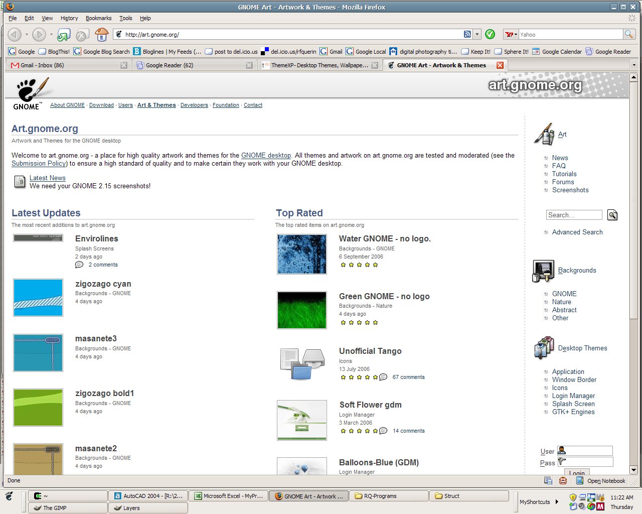
Now, Linux is no stranger to ugly desktop themes. It has its own fair share. But when you're used to browsing open-source and free software sites for so long, going back to windows targeted sites is a bit of a shocker. Compare the two screenshots below to see what I mean. Lots of open-source project sites might be unpolished and plain, but I'll take that over flashing banner ads and blinking lights every time. And one other thing. That frickin' smiley faced thumbnail at the top left of the windows one, is in the top left on every single page of thumbnail results you page through. They must have paid more for that privilege. If you'd even call it a privilege.
Incidentally, I ended up sticking with my Clearlooks - Gnome-based theme for my workstation. Surprise surprise.


0 comments:
Post a Comment