
First I started by creating a simple blue filled rectangle without any visible outline like this:
 Then, by double-clicking the rectangle and Ctrl-dragging the adjustment grips I created rounded corners:
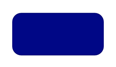
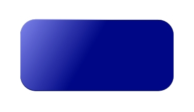
I then selected the shape and hit Ctrl-D to create a duplicate of the object. I then changed the fill colour of the duplicate to be a light blue. Also, I applied an opaque to fully transparent gradient over the left end of this light-blue rectangle. This is done by selecting the object, clicking the gradient tool and adjusting the gradient grips to suit your taste. Here's the result so far. Obviously, the lower object is the one with the lightened colour and gradient adjustment:

Putting the light blue object directly over the original rounded rectangle gives you this:
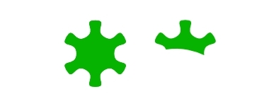
Not bad so far. Now for the green inlaid button. First I created a simple green-filled shape with the Star button, making some adjustments to the shape controls. I chose to hide the outline of the object as well. Here's what I came up with for a shape. You could use just about anything you want for a starting shape:

At this stage, I duplicated the shape you see above and moved it to the side. I then created an outline with the Bezier curve tool. I'm going to use this shape to generate a 'shine' on the green button. Here's the green shape, it's duplicate and the path I'm going to use:

I then selected the star on the right along with the path-shape and used the Path->Intersection command to generate a resulting object as shown below:
Then I selected the resulting partial star shape and adjusted its fill colour to be a very light green. I also adjusted the overall opacity of this shape to be about 50%. Here's the adjusted object:
 Overlaying the lighter shape on top of the darker one gives a nice button with kinda of a shine to it:
In this next step, I took the full star object (the dark one), duplicated it, and moved it over the right. On this duplicate, I turned off the fill, turned on the outline, set the outline thickness to something like 3 and then applied a gradient on the outline itself. The gradient went from a dark blue on the upper left to a light blue on the lower right. It's tough to explain in words - better that you see the result here:
 The outline itself is created this way to make the final green button look inlaid into the rubber. You could probably create this outline directly on the darker green star object without creating a duplicate. But separating it makes it easier to see what I did. Now overlaying the gradient outline on top of the shape gives this:
 Now all that's left to do is plunk this button on top of the blue button we created in the first three steps and we've got our final inlaid button!
 I am no graphic designer by any stretch, but it's really not that hard to create attractive graphic objects with Inkscape. The gradient features along with transparency can really open up some possibilities. Once you create something you like you can re-use those concepts to create other things (like that dark-green, light-green concept to create a glassy effect). You see that all over the place. It's easy to do and can yield quite nice effects.
I hope you found this somewhat useful. If you've got any suggestions on how to do it better, quicker or more efficiently, please let me know in the comments. I'm still an Inkscape newbie and always looking for good pointers.


0 comments:
Post a Comment